Creating a visual brand identity and design system for the Charlotte Sister Cities Association.
Project Overview
The Charlotte Sister Cities Association has struggled to raise awareness of its existence and its mission in the community. A robust visual brand identity and an easy-to-use design system would be necessary to unify, empower, and raise the efficacy of marketing efforts.
My Role
Research
Conducted surveys to better understand current brand awareness. Perform market research to understand industry trends.
Strategy and Positioning
Identify our niche in the international non-profit space in Charlotte. Foster a brand identity and value proposition that is instantly recognizable within that landscape.
Visual Design
Design visual brand identity elements, including logo, color palette, and other design guidelines. Create assets for brand expression.
Logo Concepts
Initial icon sketches and explorations
Final icon direction
Primary lockup
Final lockups
Design System
Our design system is a whole collection of design components, guided by clear standards, that can be assembled together and provide a consistent experience. Imagine a big box of Lego pieces that can be assembled in near-infinite ways. It’s the embodiment of a system of concepts, it is the brand as a whole represented by its individual pieces. Nothing exists in a vacuum. These pieces must all work together in harmony.
Color
We want to own a color, and that color is Charlotte Sister Cities Blue. As such, all other colors in the palette should work together to highlight our primary color.
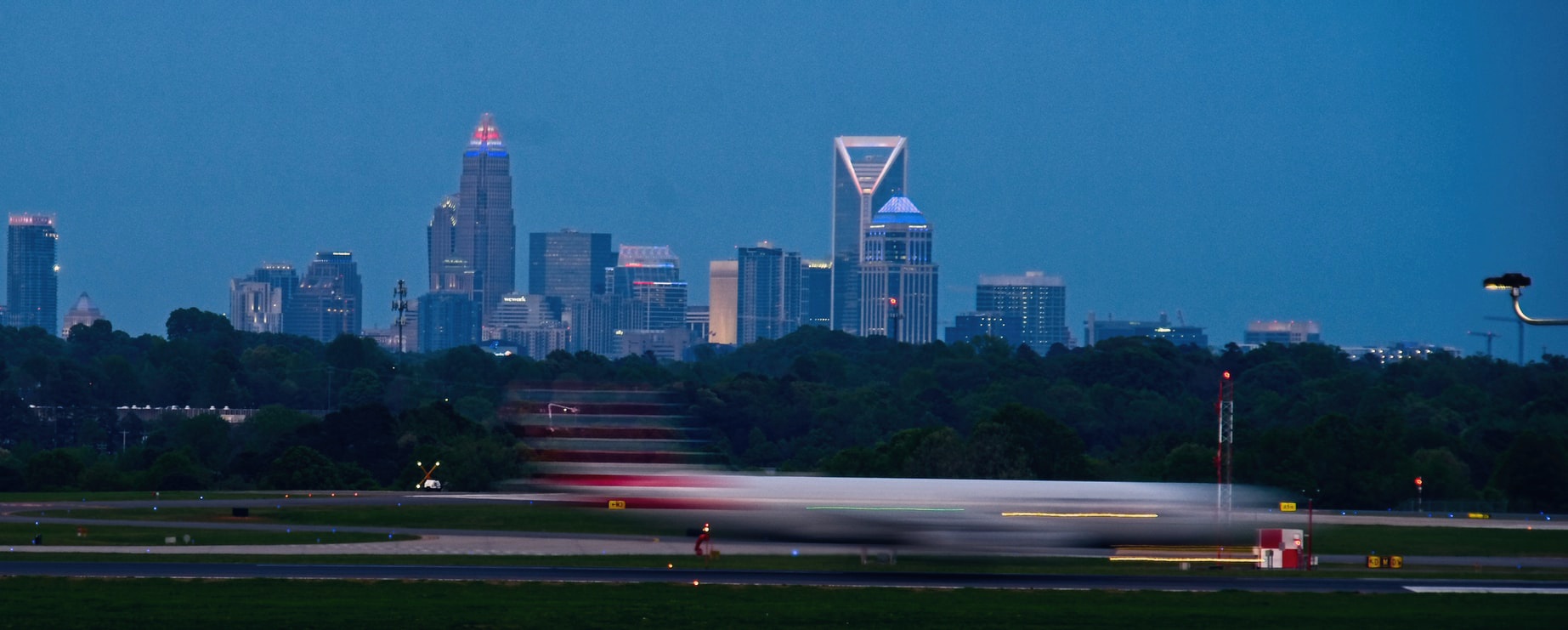
This color has a strong sense of place in Charlotte, between being the color of the sky as it reflects off our glass skyscrapers and being an accent color for our professional sports teams. Our neutral colors also have roots in North Carolina, such as Sand Dune (our warm grey) and Magnolia (our cool grey).
The colors should be harmonious with standard colors available for physical materials, like t-shirts, tote bags, and so forth, to make color matching easier for less-experienced volunteers in the organization and ensure consistency across expressions.
Typography
We use Google Fonts because they are free, accessible to everyone, and easy to read in the digital world.
Photography
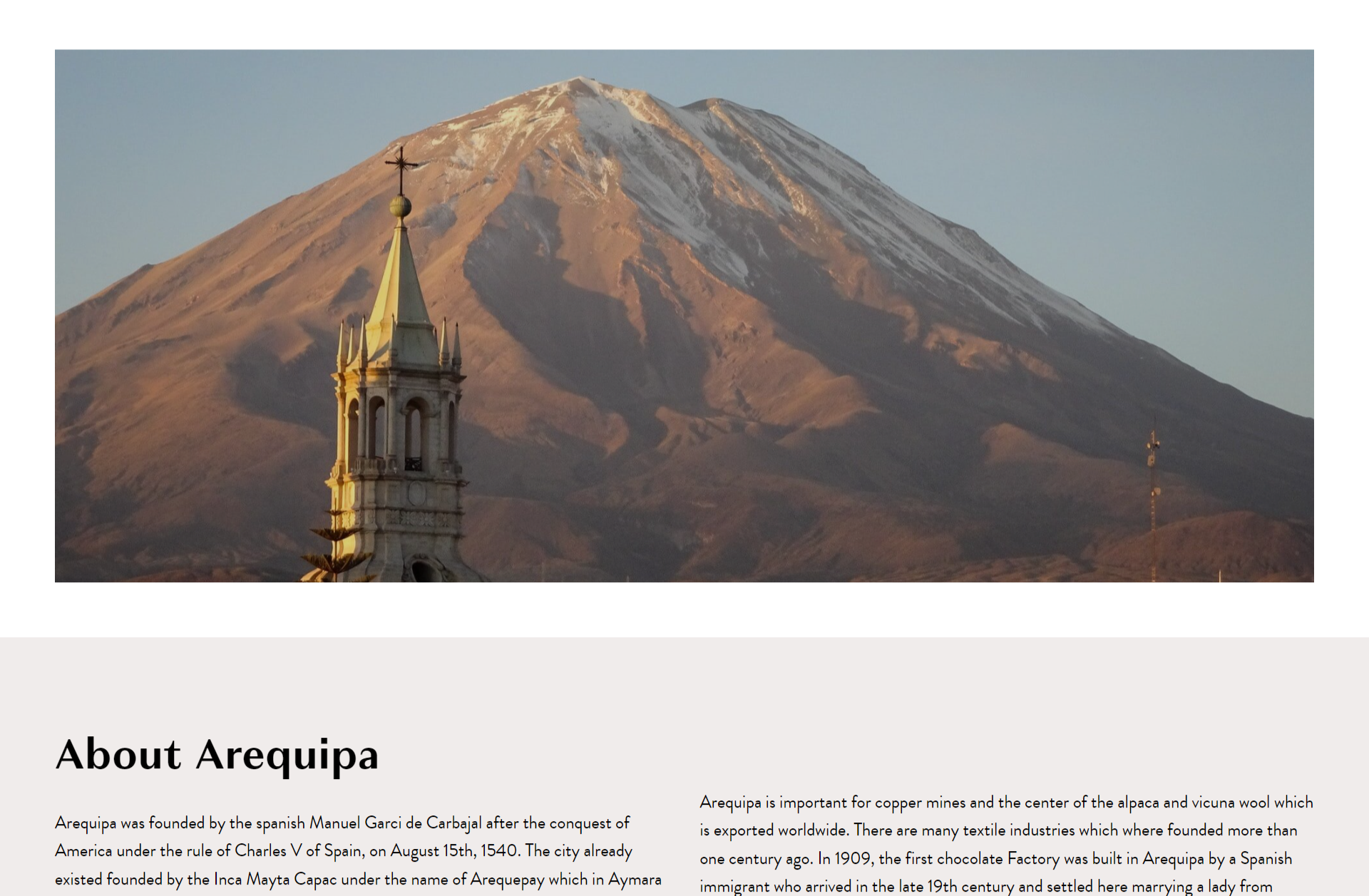
Bringing people and places together is what we do. Using photography that consistently highlights people and places will allow us to convey our mission and focus to the outside world.
Logo Usage Guidelines
The logo should always be full-color and placed on approved background colors for accessibility purposes.
Results
