Building a new microsite template for Financial Research Associates.
Project Overview
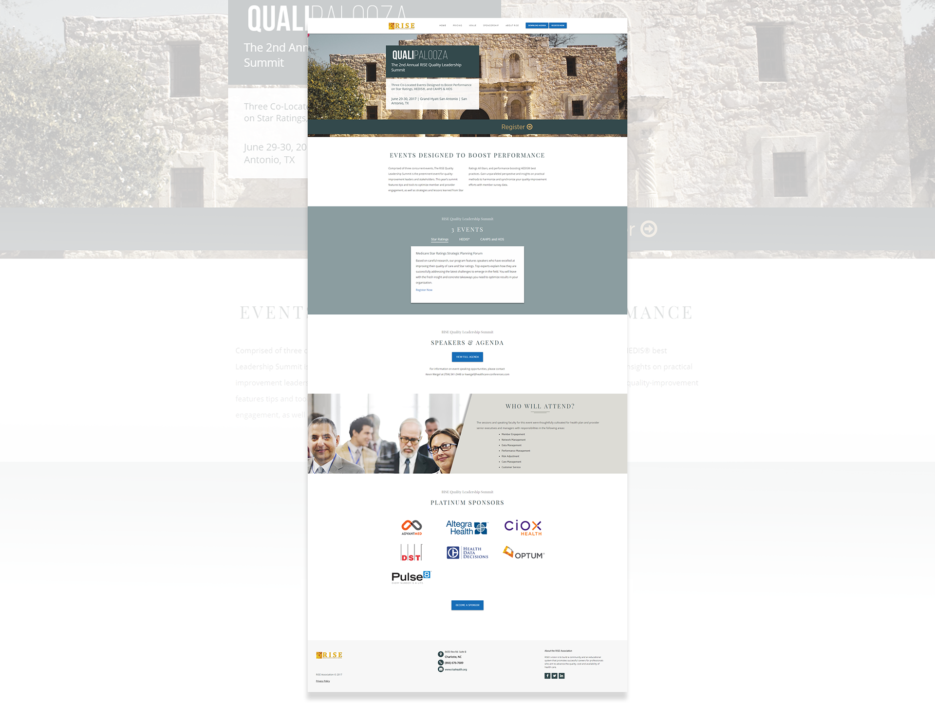
I was brought in to Financial Research Associates to establish a modern web presence for their 80+ conferences annually. Over the course of a few iterations, I built a microsite template which increased engagement, connected marketing and sales, and gave their web presence a more modern feel.
My Role
Research
Conduct user research and usability research. Created a white paper outlining the 5 most prevalent user browsing behaviors, which informed 5 browsing personas.
Data and Analytics
Installed 3rd party integrations to collect site data. Analyzed data results and used findings to inform further iterations of the web template to reach engagement goals.
Information Architecture
Organize information in a way that promoted clarity, ease of comprehension, and was appropriate for various stages of a customer journey.
Visual and Interaction Design
Design user interface for microsite template. Create new UI components and design website look & feel.
Front-end Development
Code in HTML, CSS, and Javascript. Work within the tech constraints of the CVENT platform and make use of their features where possible, such as data tags.
Opportunity
How can we create a new, scalable microsite template that looks modern, captures important data about usability, and becomes the main hub for registrations?
Before & After
-
Original Template
This is what the conference site looked like when I first got to FRA.

-
First Draft
I laid a new groundwork in the span of a week. This is the first iteration of the conference micro-site that I introduced at FRA.

The adoption of this new site was difficult for most people. The organization as a whole was very resistant to change. In order to help sell the effort to create a 21st Century digital presence, I created a new micro-site order form that was quick and easy to use. The Conference Producers, who traditionally wrote website copy in this organization, were pleased with the amount of time this new form saved them. I introduced this in a flashy internal email, and it was (somewhat warily) adopted as the new process.

Initial Data
Now that the site had been adopted, we began to get feedback from our data and from internal stakeholders. This marked the beginning of a long development effort.
The first key change was the result of a request from conference producers to add more content to the homepage above the fold. Of course, this was met with some skepticism on my part, as that would probably make the area above the fold far too wordy and a poor user experience.
After receiving much internal pressure to find a solution, I introduced a first approach. I created three boxes to act as “featured content” near the top, that could provide fluid content, which didn't require updates to the web code itself.
I found that users didn't really engage with these boxes, as you can see in the above heat map of clicks. After some time, I developed a new approach.
This new tactic was to create an animated content tool to the top of the page where people could essentially "opt in" to a topic and receive a slider of information about that topic. This would hopefully keep the area above the fold neat, while adding a ton of information, and keep the conference producers happy. It would also give us an idea of what topics people were most interested in.
I imagined a video as a way to bring someone in to the experience, and lots of slight hover animations to hint at further interactivity as they explored the landing page.
The initial idea was that when you click a subject, the content rolls out over the video.
Implementing this new solution was a success!
We saw an increase in engagement and clicks from the previous iteration. It also gave us some insight into which particular topics were the most interesting to our clients.

Improving information architecture and user flows for our flagship event: RISE Nashville.
Merging browsing behaviors with company goals.
After a few months of gathering data and analyzing the results, I wrote a white paper outlining the 5 key browsing personas. Based on those findings, I created a journey map to try to better align the information architecture of the site experience.
I started with a rudimentary, color-coded user journey sketch and modified the micro-site architecture structure as necessary.
The result of this overall micro-site revamp was a huge increase in clicks and engagement, and a significant decrease in the amount of the page that was previously unseen by most visitors.
Results
Improved click rate by 400% on largest conference website (over 60 days of data collection)
Reduced page space seen by less than half of visitors from 50% to 2% over the course of 3 microsite iterations

One final shot.
For RISE Nashville 2018, we wanted to totally revamp the micro-site, yet again. This time, we needed to do so with measurability in mind, as this was our largest conference of the year and best possible glimpse into user behavior.
The marketing team developed a message for the campaign based on search engines. Naturally, I thought the site should reflect a search engine feel and actually try to demonstrate that this conference had the answers to their questions.
The wireframes we developed followed that idea, and allowed for a flexible response from the website to show what the user was seeking.
The key technical requirement for this project was that we needed to reload the page anytime a user clicked on something in order to track user movement in Marketo.
My solution was having all of the div elements live on the landing page that we wanted to cycle through. Only the pertinent information would display at any given time. I wrote javascript that refreshed the actual site url, but added a hashtag that could be detected in the script and decide which information to display at that moment.
If you notice the address bar in the video below, #r3 is appended to the URL to display only the results for question number three in the search engine dropdown.


